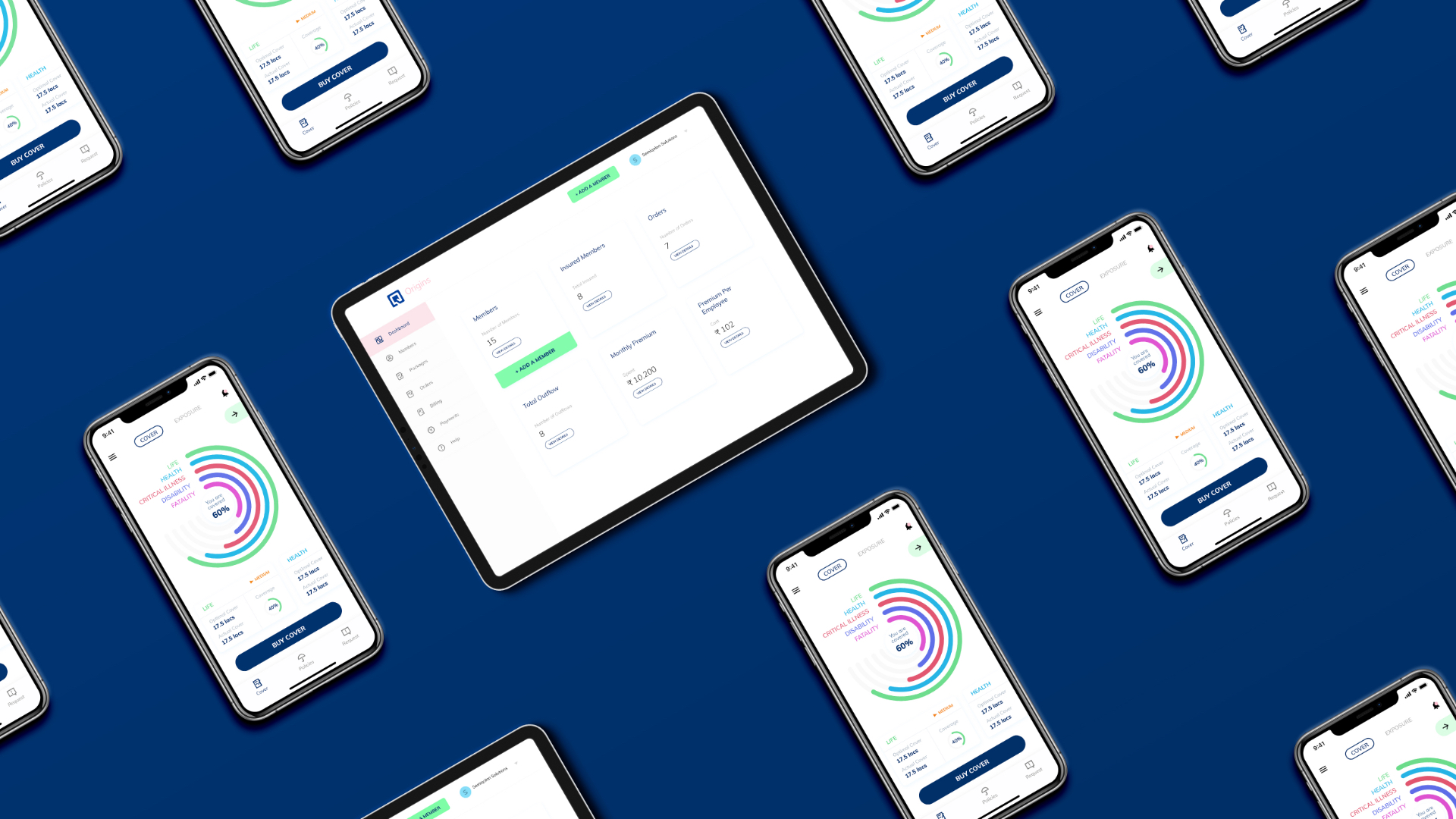
Insurance
made easy
Industry
Fintech
Type of Work
UX Design
UI Design
Design System
Iconography
Insurance packages can be complex, from having multiple insurance covers like life, health etc. to extremely lengthy documentation and a lots of hidden charges which are difficult to find unless you are specifically looking for them, and even after that you would have to figure out if this policy was for you or not.

Making Insurance transparent and easy to buy
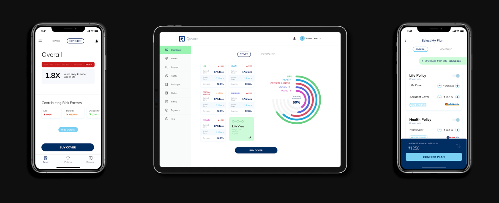
After completing our research we started out to make something that was transparent and would directly benefits the consumers. Early on it was decided that the app needed to clearly specify all the features of the policy, what it covered and how much it ultimately cost.
Initial Wireframes
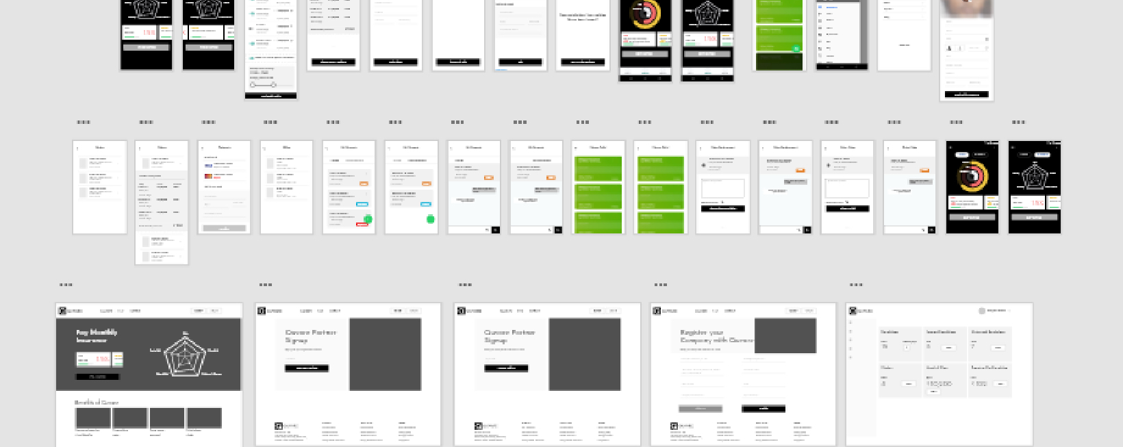
To implement all that we had learned we discussed a few ideas on how everything inside the app might work and started working on the basic wireframes.
Refining and Polishing
To implement all that we had learned we discussed a few ideas on how everything inside the app might work and started working on the basic wireframes.

Building a design system
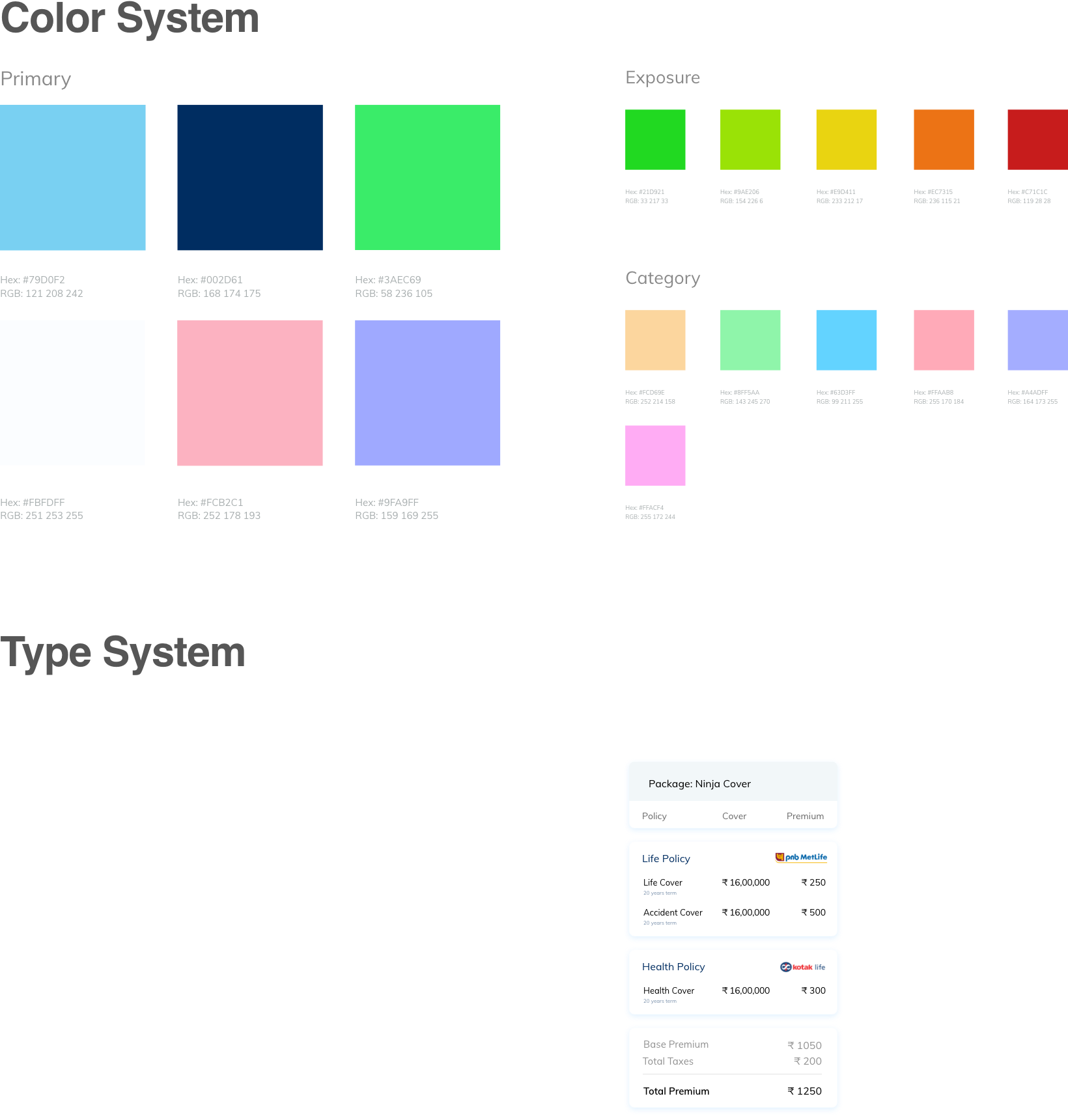
To create consistency across all platforms we developed a design system of colors and type.
Iconography
We built custom icons from scratch for Quvare.
on time;
every time.